

USA TODAY Homepage Competitive Analysis
How did we stack up against the competition when it came to our key design criteria?
As the first step of the redesign of USA TODAY, we needed to better understand how other sites were meeting user needs, what gaps existed, and how we might serve users best.
To begin, I had to choose the criteria I would be using to compare all of the sites we’d aligned on as appropriate competitors. I chose to focus on items that we had identified as design pillars:
Enables Catch Up
This site gives users the opportunity to catch up on the latest news and !nd out what they might have missed recently (in the last 12-24 hours)
Helps Deepen Understanding
This site helps the user to deepen their understanding of major events through analysis, story batching, continued coverage, or opinion articles
Eases Discovery
This site makes it easy for users to discover something of value that is unexpected (may include coverage, products, touchpoints, content of interest, etc...)
Feels Premium
This site prioritizes UX, UI, performance, and personalization to provide an unusually superior or delightful experience
Summary of all 20 sites:

Scoring legend:
0 = Does not do it at all
1 = Does not do it on the homepage (possibly hints that it does it elsewhere)
2 = Does not do it, but provides certain elements of it on the homepage
3 = Does it minimally on-page (but provides user with tools to dig deeper)
4 = Does it explicitly
5 = Does it and makes it a priority on the page (goes above and beyond)
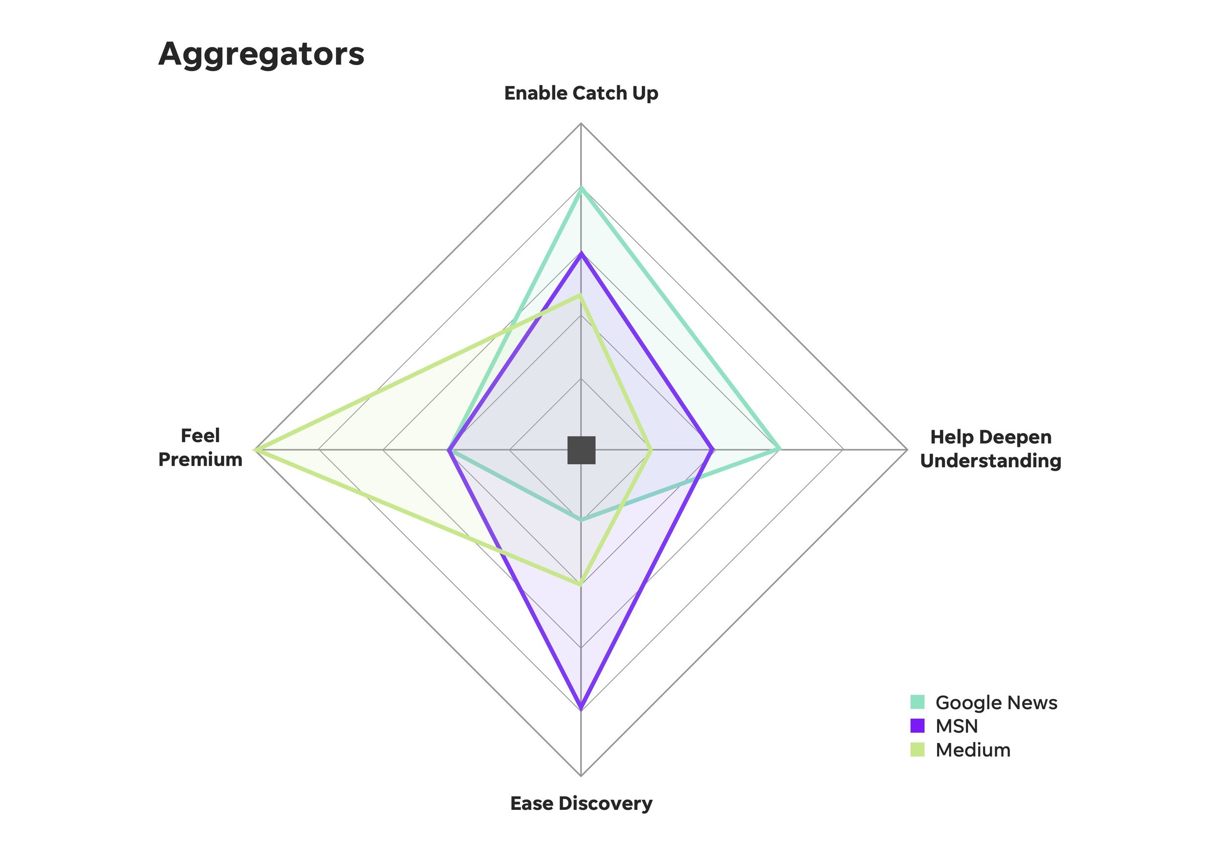
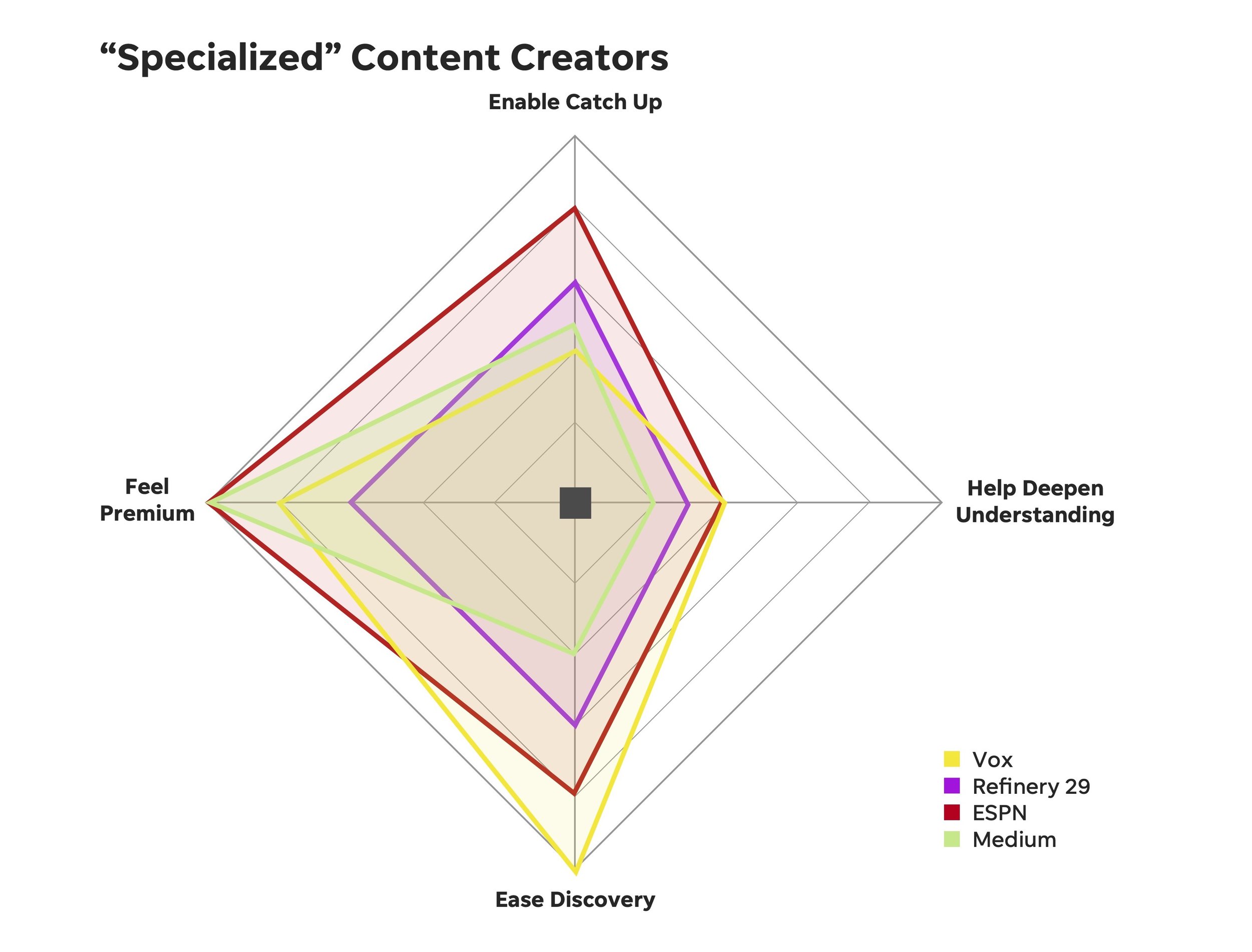
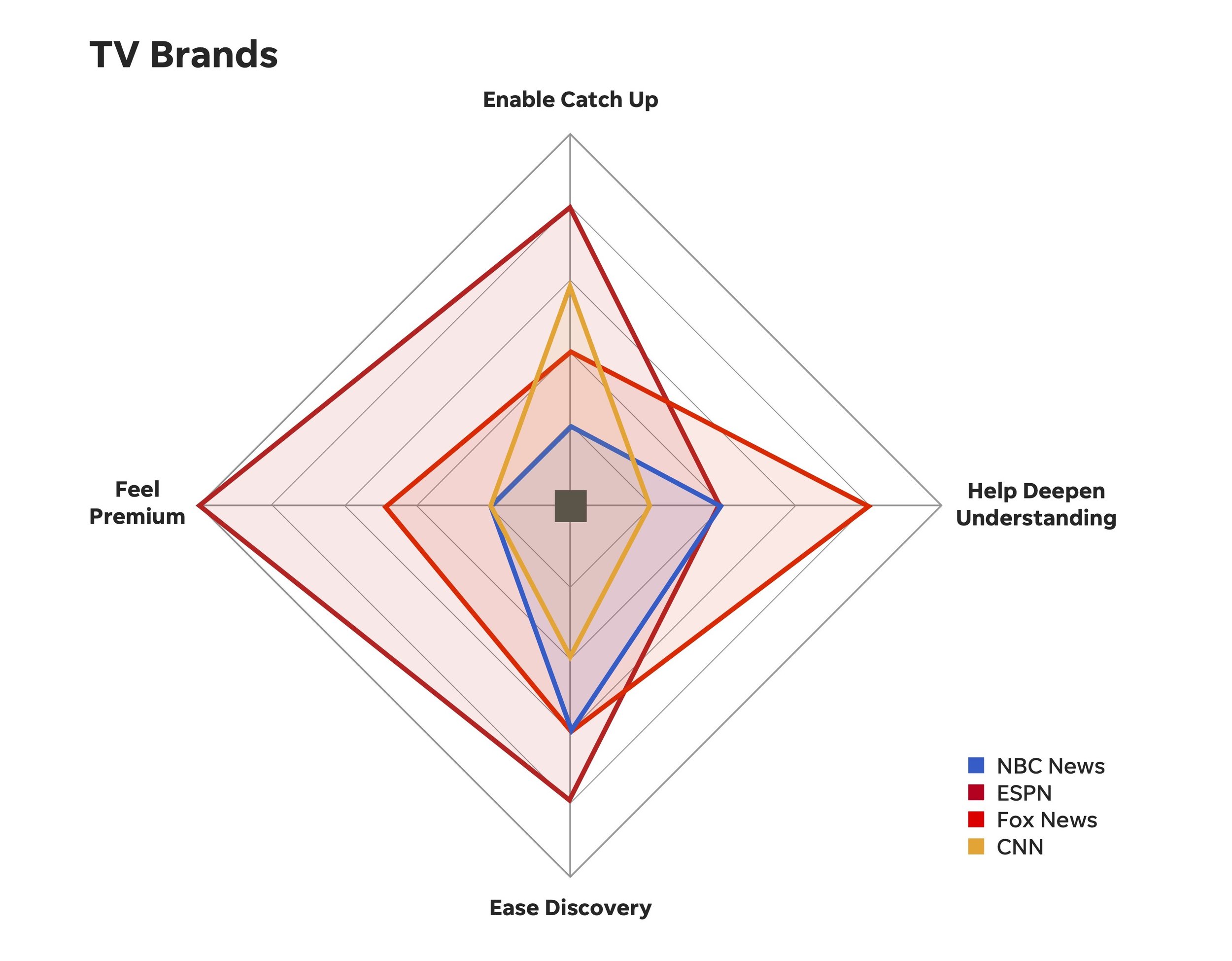
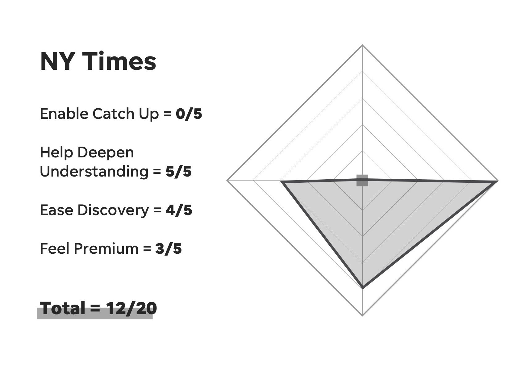
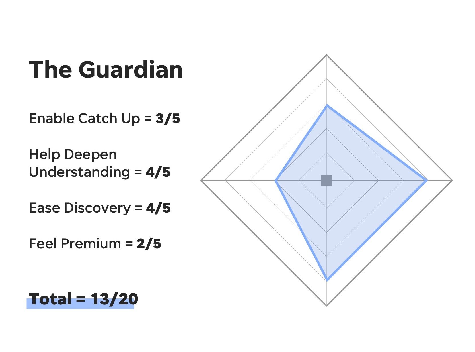
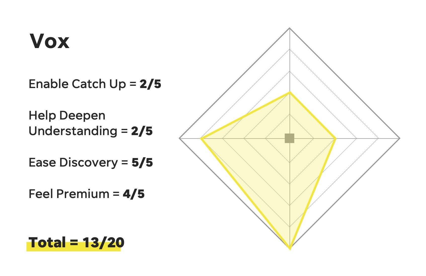
Competitors by theme:
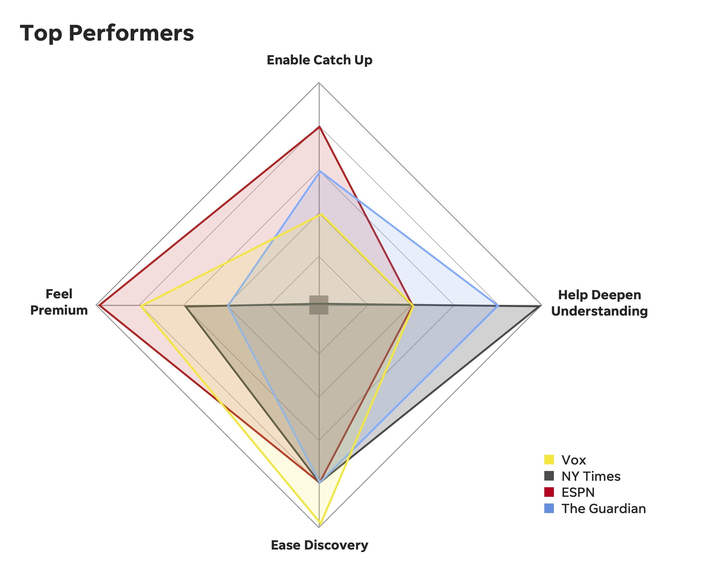
Top Performers:
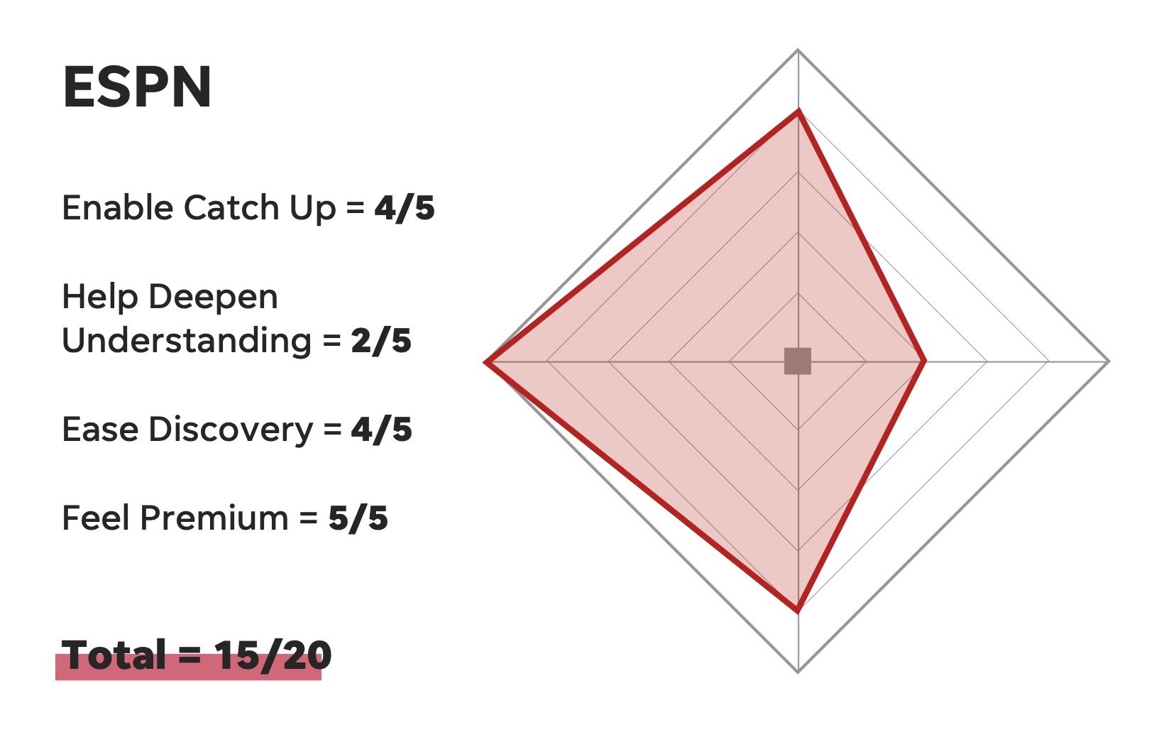
So how did USA TODAY compare?
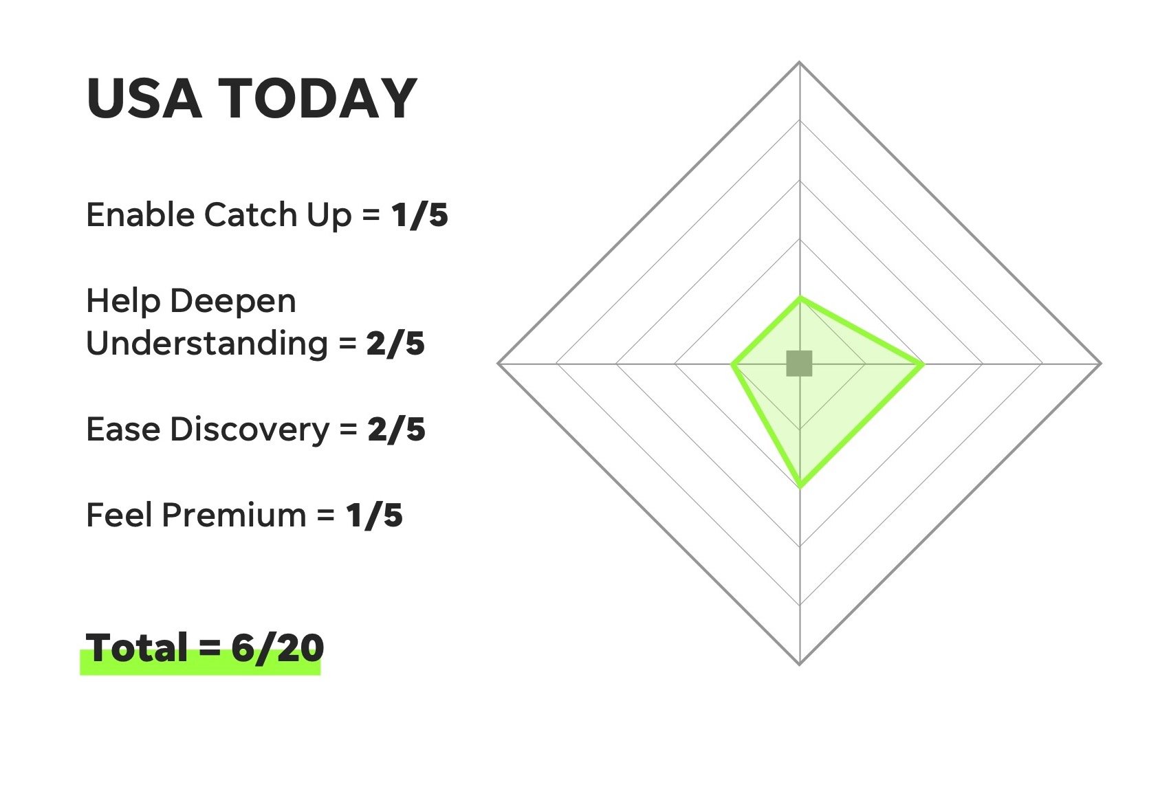
As you can see, my findings were less than ideal. Delivering this news wasn’t pleasant, but it helped to align our leadership team and get the entire enterprise working towards a common goal.
My final recommendations:
Being great at 2 things works better than being okay at 4 things.
In 3 out of 4 cases, our top performers did certain jobs very well. No single site scored a 5/5 on multiple jobs. Overall, sites that focused on doing specific jobs very well provided faster, cleaner, more elegant experiences than those that attempted to do everything at once. What jobs might we be best equipped to accomplish for our users?
Top performers prioritized easing discovery for users.
All 4 top performing sites made a significant effort to expose users to new or delightful products. These products were not necessarily the same types of media, but all felt important enough to be showcased on the homepage. Whether it was a podcast, a new series, or a newsletter, it is clear that these sites value those investments enough to give them high-traffic space.
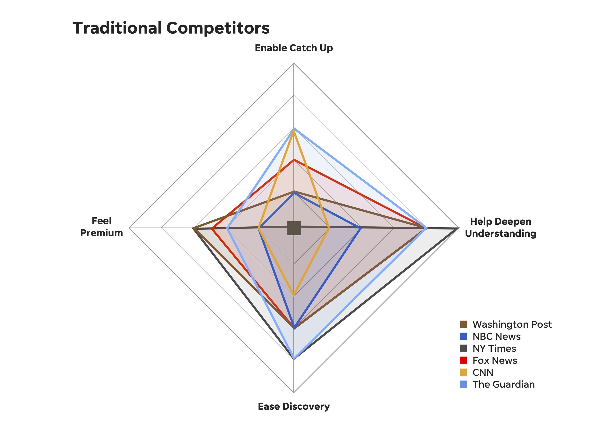
Our more traditional competitors focus on similar jobs
When we compare WaPo, NBC News, NY Times, Fox News, CNN, and The Guardian, we see that our traditional competition tends to focus on deepening understanding and easing discovery. Knowing this, we may want to explore blue oceans by designing for other jobs.